top of page

WORD COUNT: 2140
SACE NO. #922148L
Post Card Development...


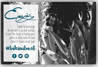
Using Adobe Illustrator I created this postcard with the photo of the palms I took as a backdrop. I then drew a transparent rectangle and wrote a small paragraph in 2 different fonts. I put the logo in the left corner and the hashtag in the right with a slight drop shadow. In the same font and colour as the hashtag, I wrote up the top 'Thank you'. I also put the 3 social media logos down the bottom. As for the other side, I simply put the logo in the centre of the page with the website underneath. I then also put 'xx' in the left bottom corner.


I then removed the logo from the front because it looked clumsy especially because it's already on the back. To the back, I spaced out the letters of the website because it's easier to read and looks more professional. I also moved the 'xx' to the top left to give the website room.
I added a drop shadow to the 'thank you' and reshaped the transparent rectangle to cover the 'thank you'. I also recoloured the website on the back to a grey.


For this postcard I again used an image I had taken as a backdrop. I then drew a rectangle in the left corner and made it slightly transparent. Over the top, I wrote in three different fonts and added the social media icons below. For the back, on a lightly greyish background I put the logo on the right side as well as the website down the bottom. On the left side I made a array of words.
Here I changed the colour of the title, hashtag and social media icons to a dark blue colour to bring colour into the front. For the back I also used the same colour for the quote so that it went with the front.
I then turned the title and the hashtag into a light grey while leaving the social icons the same blue colour but adding that colour to the middle paragraph. I made the quote on the back the same grey colour to blend with the front as well as the website. I also centred the website with the logo and spaced the letters out which looks much more professional.


I again used a photo that I took as a backdrop and ran diagonal transparent lines through the photo for texture. I added the transparent rectangle in the left corner. over the top I used three different font and the three social icons in the right bottom corner. For the back I put the logo on the right side with the website centred in the middle. I then place a palm vector in the left top corner that I created using the Adobe Capture App.
I then removed the diagonal lines as it looked cluttered. For the back I moved the logo to the centre and duplicated the palms three times. I use the transform tool to rotate and reflect the palms to fit in each corner. I then added the ripple effect to the bottom two palms with the effects to make it seam like a reflection on the water of the two above palms. I also spaced out the website and coloured it grey.
I water to add some colour so I attempted the mask tool to bring her bikini to life. I tried to make the social icons work with the bikini but I don't like it. For the back, I moved the logo up and duplicated it and reflected it. I then made the length a lot smaller to make it also seem like a reflection.
Here I recoloured the title and hashtag to a navy blue colour to go with the bikini and removed the social icons but I still don't like this look. For the back I shortened the length of the logo and added a faint blue lake shape to the bottom of the page to enhance the refection look. I resized the palms as well so that the bottom two are smaller. I also made the website smaller by removing the 'www'.


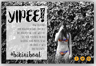
For this postcard used the layout photo I took and placed it on the right side and a white rectangle to filled the rest on the left. I then created a small blue diagonal line and duplicated it as many times as it took to form a border type line to separate the photo and the caption. I then put the logo on the top of the rectangle and under neath, put the caption. I also put the social icons in the right bottom corner.
Here I changed the 'yipee' to 'horay' because the 'yipee' didn't seem like it fitted very well. I then created the back by using the palms photo as a backdrop and placing a white transparent circle in the middle. I then put the logo in the middle with the website under neath.
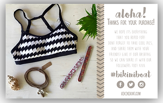
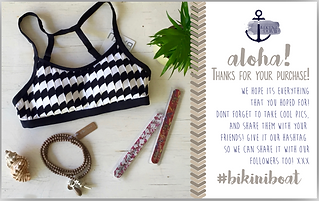
I removed the logo from the front because It's already on the back and replaced it with this triangle shape I traced off of the towel in the photo using Illustrator. I put this shape top and bottom of the rectangle. I recoloured the border line and middle paragraph in maroon to go with the bracelet in the photo and recoloured the title and hashtag also in a lighter blue. I also recoloured the social icons maroon. For the back, I recoloured the website font maroon to go with the font and also changed it's font to go with the logo.
Here I simply recoloured the triangle pattern shape maroon.


For this card I used another layout photo on one side and filled the other side with white. I placed the logo up the top and created a pattern on as a boarder to separate the photo and the caption. I used the colour picker to select the colours for the boarder and for the fonts. For the back, I again used a photo I took as a back ground and drew a long transparent rectangle down the bottom. I also drew a transparent circle to place on the left of the rectangle. I put the logo in the circle and the website in the rectangle spaced out.
Here I removed the logo from the front as it's on the back. I also recoloured the middle paragraph to a light cream colour and added the social icons at the bottom. From the back I removed the circle as the logo didn't sit in it right. I moved the rectangle to the bottom of the page and resized the logo to fit next to the website. I also tried a new font on the website.
Here I removed the website from the back and put it at the front under the social icons. For the back I then resized the rectangle to be vertical on the the right side wide enough to fit the logo in the centre.


For the front of this card I used a photo I took for a back drop and drew two white circles on the left, different sizes and transparency. I placed the logo in one and the caption in the other with a top and bottom decoration. For the back, I filed the background with a few different online shopping quotes. I put a white transparent circle in the middle with the logo in the middle of that.
Here I rearranged the circles and made the logo circle smaller. For the back I tried reversing the colours by making the background grey and the font white.
Here I got rid of the circle with the logo because it looked clumsy. For the back I tried changing the background to a navy blue to go with the logo which works well.


For this card I made a photo collage and in the centre I left a space for the logo and website. Making each photo fit correctly was difficult, therefor the logo no quite being centred.
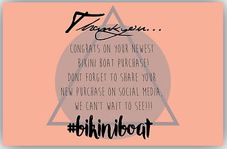
For the front I used a watermelon colour for the background. In the centre I drew a transparent grey circle and a triangle outline over the top. I evenly spaced out the text in the centre of the page. For the back I had to rearrange the photos so that I filled the gap of the logo. I put a white transparent circle over the middle and place the logo and website there.
Here I recoloured the black font navy blue to got with the logo and made the circle on the back less transparent. I also made the logo bigger and changed the font of the website to go with the logo.
bottom of page