top of page

WORD COUNT: 2140
SACE NO. #922148L

Logo Refinement...


To refine this design I inverted the colours and made the tube white where it was blue and the blue, white. This makes it look more welcoming and classy.
Here I simply added a drop shadow to give the logo a 3D effect and enhance avoid the white of the logo blending in with the background
I added the rope around the tube for more detail to make more sense of the image, I do like this logo but it is a lot to look at.
I wanted to give this logo a boarder to make it look more professional so i drew a circle around it, but it doesn't fit around the logo perfectly.
I decided to try a different shape with out curves but this still doesn't look right.
I cut the bottom corners off the triangle and came up with this shape which I believes works well. This logo looks good but isn't the style I was hoping for.
For this logo, I changed the font to a much more professional and classy looking font. It still looks quite basic.
I inverted the colours by getting rid of the full blue circle and making the font and the image blue.
I then put a blue circle outline around the logo to give it more class. The font looks uneven on the two sides of the anchor because one word is longer then the other and if I were to resize it, it would still look uneven.
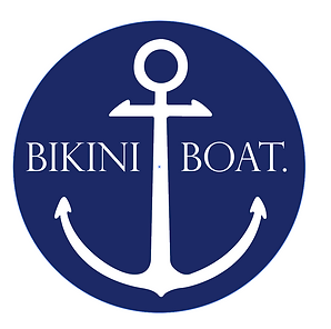
Here I drew a white box over the middle of the anchor and put the font in the middle and resized the 'BOAT.' to make it even with the 'BIKINI'. I also resized the circle to fit around the logo closer. I really like this logo although I feel like its a bit boring and seen before.
To refine this logo I made the font bigger to the width of the circle.
Here I darkened the circle and the font to make it seem for navy then grey. I also wanted to make the anchor more individual to my business so I put the three lines through the middle. I believe that this makes the anchor more individual and unique to the business as if some one were to see a normal anchor thats all they would see and wouldn't associate it with my label. Therefor having the lines would make people associate this anchor with my label when ever they saw it.
I again darkened the blue to give more of a navy colour. This would be my logo of choice so far as I love the watercolour.
For this logo I replaced the original circle anchor logo with the new anchor that was in progress, I then swapped it for the new anchor with the lines. I do like this logo but I believe it is still to wide for a logo.
Because I liked the watercolour look so much I decided to try a new watercolour shape. I downloaded this image off the internet and opened it in photoshop.
I then selected the part of the image I wanted to use and went Edit > Define Brush Preset. I then pressed okay which created a brush of this image.
I then created a new document and used this brush in a navy grey colour.
Here I changed the colour of the brush a little darker. I also added the name in the same font as the one used perviously.
I then tried adding the anchor on the right and bringing the text over to the left. I coloured the two B's the same colour as the watercolour image so that it was visible against the white background.
I switched the anchor over to the left side and coloured it with dark navy blue and left the two middle lines white which I love the look of. I also coloured the bottom text the same colour as the anchor.
Here I enlarged the anchor to make it the focus of the logo and coloured the rest of the text into the same blue.
I coloured the bottom text white to make it balance with the colours of the anchor.
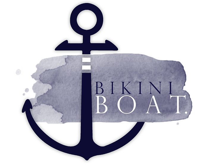
Here I cut the right hook off intending to give the look of the watercolour folding through the anchor. I then also moved the text down to the right bottom corner and resized the 'BOAT.' to fit the watercolour nicely.
Here I added a drop shadow to the anchor and moved it down slightly to be more inline with the edge of the watercolour.
I used the eraser tool to erase the edge of the anchor to the shape of the edge of the watercolour to make it look more realistic as if its folding underneath the watercolour.
This is the final logo. I have chosen this one as I believe it all works well together and is well balanced. I also really like the colour combinations as well as the shape of the entire logo. The best thing about this logo is that its not to busy but its also not boring and plain.
bottom of page